01.
Brand strategy and groundwork
We started with employee and patient interviews, and quickly found that Alternaleaf is a brand that genuinely cares. Stories of employees going above and beyond to deliver on time, and patients whose lives had been transformed by the products, confirmed we had something real to work with. From there, we ran intensive workshops with the wider team to define a clear positioning, purpose, and personality for Alternaleaf. Through that process, we mapped where the brand sits today (a company that deeply cares for its clients) and where it needs to go: educating a wider audience and destigmatising cannabis for medical use. Our brand strategy recommendation was to anticipate the changes ahead and communicate with a balance of progressive insight and quiet confidence. Medically credible, organically natural, and progressive without alienating newcomers.
.png)


For its written communication, we defined three tone of voice pillars. Alternaleaf goes beyond care to actively empower clients to improve their quality of life. It breaks down barriers, catering to audiences from all different backgrounds. And beyond simply providing medicine, it champions holistic health and well-being. With this groundwork established, we could focus on building a visual identity that would bring these values to life.


02.
Turn a leaf concept
Turn a leaf: a concept so clear, you can practically hear it in the brand's name. The imperative to turn over a new leaf, to make a change and start afresh, puts the power firmly in the individual's hands. You can manage your pain, improve your mental health, sleep better. The twisting visual device, which always moves down to up and left to right, symbolises that upward progression in quality of life.


The device is embedded in the wordmark's A, instantly connecting the logo to the broader communication where the twist forms the foundation of a flexible and dynamic visual system. We paired this with the approachable, geometric typeface Mier B, used consistently across all brand touchpoints.

03.
Brand identity system
The colour palette balances warmth and approachability with tones that communicate calm and trust. We deliberately moved away from the overdone greens saturating the competitor landscape, and the psychedelic-neon territory that would reinforce the wrong associations. Photography guidelines translate Alternaleaf's positive outlook into real, diverse people in candid everyday settings. Outdoors with natural light communicates warmth and hope, while close-up, abstract scenes in nature capture a spectrum of positive emotions.

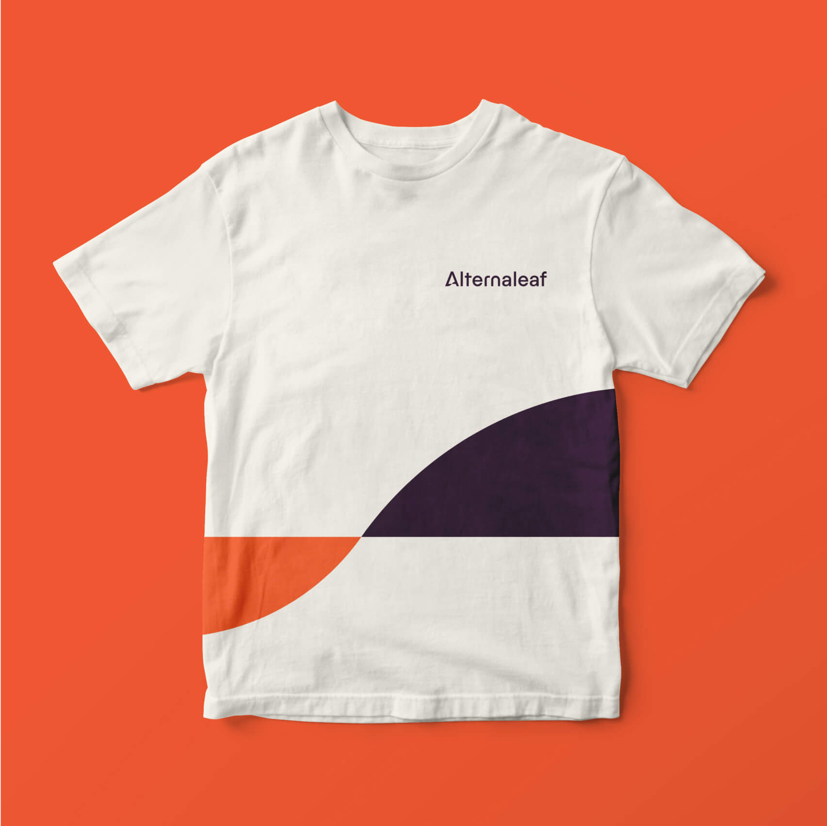
The brand identity was then rolled out across a range of current and future touchpoints to demonstrate how it could live in the world. We presented the full system to the broader team, walking through the strategic rationale and then stepping through the guidelines in detail.