01.
Brand Identity Development — Making Sense of the Puzzle
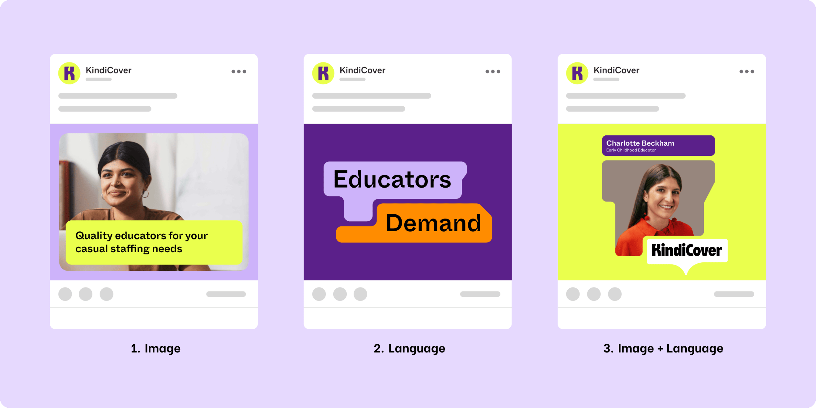
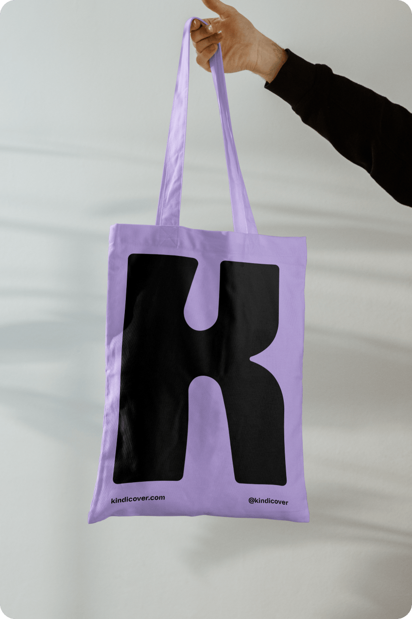
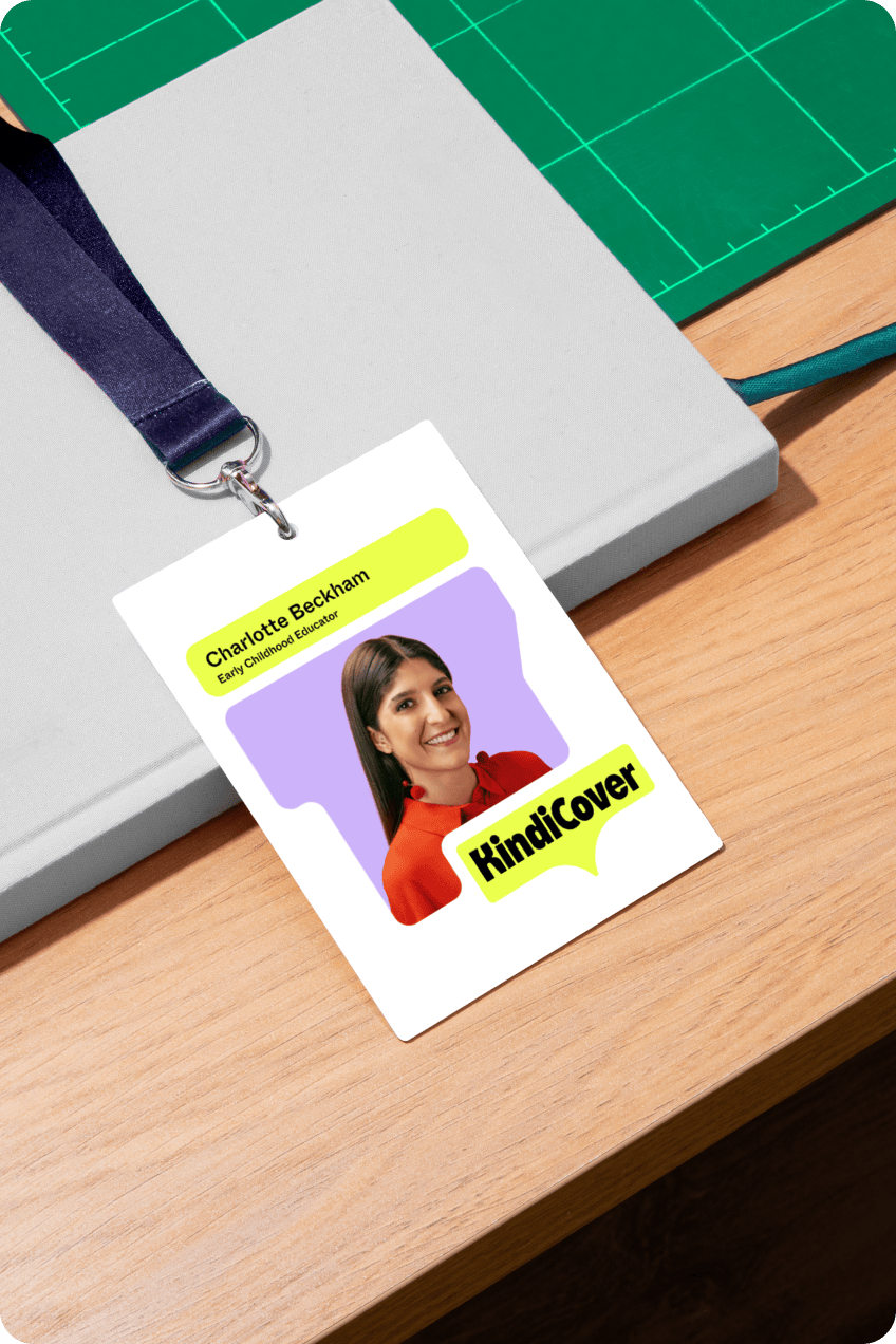
We decided the letter "K" would serve as both part of a distinctive wordmark and a standalone logo. Starting with the latter, we set the "K" as our focal point and drew inspiration from an early childhood toy — the puzzle board. From there, we created dynamic shapes, containers and speech bubbles that work as a graphic system across the identity. These elements represent communication and collaboration, emphasising how KindiCover simplifies interactions and fosters connections between its users.

Colours were chosen for their optimism and eye-catching combinations, and as a direct counterpoint to the dull, predictable palettes of most recruitment sites. Ink trap typography complemented the puzzle board devices, and the identity sprang to life. The result is a brand that's clearly in touch with its inner child — without being childish at all.

02.
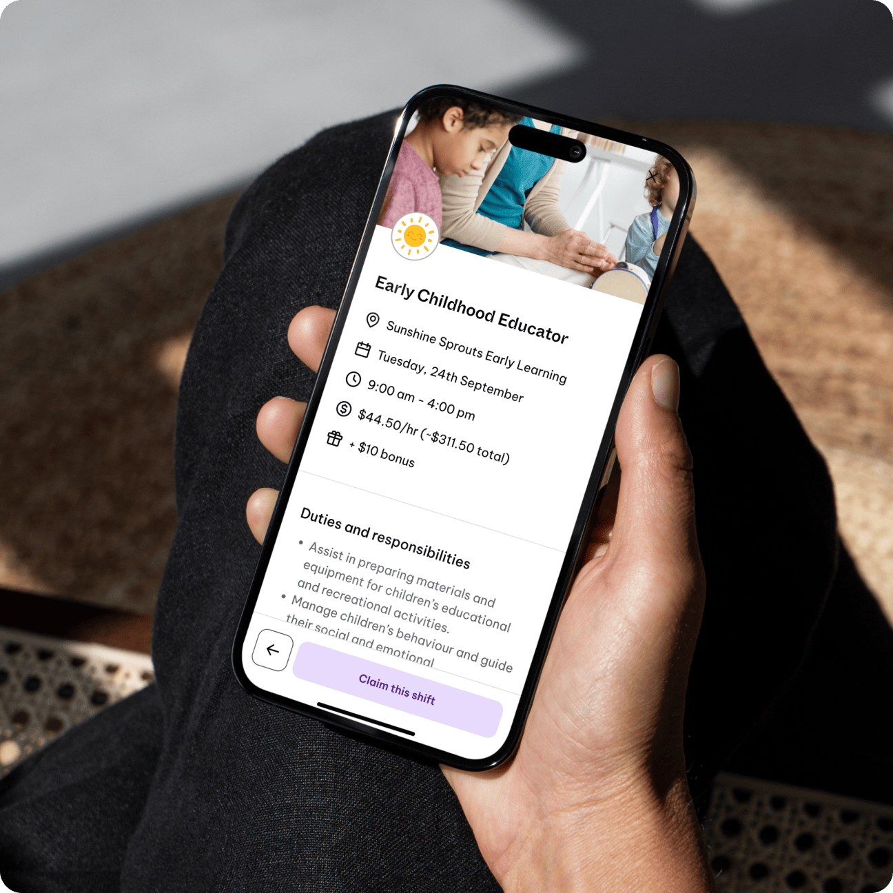
Product Design: Building a Two-Sided Staffing App
We worked with KindiCover to establish the requirements behind a complete end-to-end experience. The founders had a deep, first-hand understanding of the stakeholder challenges on each side of the platform. We mapped the user journey from both ends, designing for the nuances of mandatory licensing, shift variability, and the many edge cases that come with operating in a regulated industry.

In translating brand into product, the focus was finding the best ways to bring clarity to the user interface using brand assets. Purples and blacks form the primary UI palette, with KindiCover's bold brand yellow doing the accenting. The unique graphic shapes and connectors from the brand system carried into the product and chat module, giving the experience a consistent level of finish throughout.
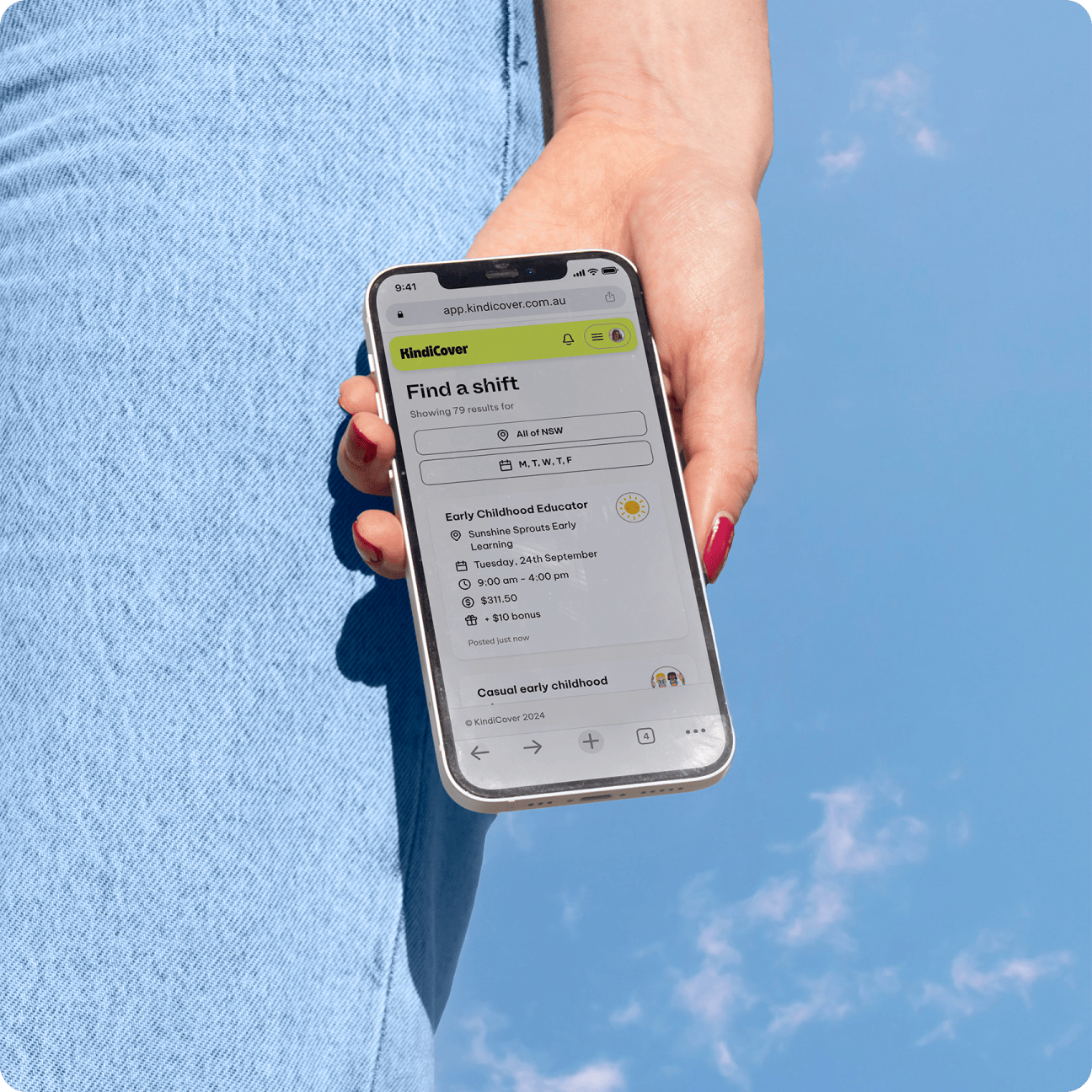


The design language between centres and educators diverged as a result of their different needs. Educators looking for shifts want to feel confident about the legitimacy of a potential workplace. Their view is visually led, with strong, readable touchpoints for scanning the market at a glance. Centres have different priorities — managing multiple educators and shifts simultaneously — so their information needed more structure and density, making the right decisions obvious quickly.


03.
Website - taking KindiCover to the world
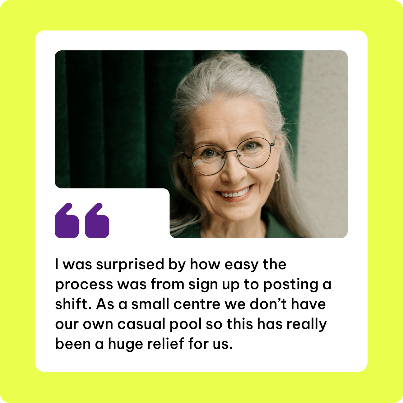
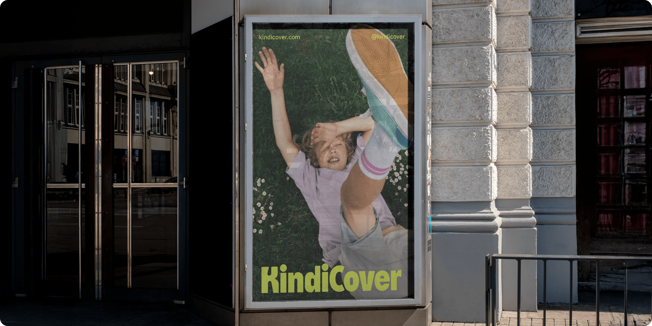
The final piece of the puzzle was a website as bold and playful as the brand itself, built to attract both centres and workers. The website isn't just the front of the shop; in this case, it really is the entrance. A responsive Webflow build splits onboarding cleanly between the two user types, and this is where the brand identity development paid off most visibly. Our puzzle piece containers house imagery or copy, and the high-contrast colour palette guides users quickly from the homepage into managing their account — keeping the experience clear and the friction low.